![Reports: setting up a Dashboard [video]](https://uploads-us-west-2.insided.com/copper-en/attachment/a0c18c2c-bd17-4d63-affd-3e852ec4a0e7_thumb.png)


Note: As of March 2022, Opportunities in the Copper left-hand menu is changing to Pipelines. Click here for more information.
Our Reporting tool is available for our Professional and Business plans and is a great way to have a pulse on your account performance through metrics with KPIs, graphs, and charts. These reports also allow you to share that information easily.
To create your first dashboard you will click the “Add Dashboard +” button at the top left which gives you two options:
-
Start with a template
-
Start from scratch
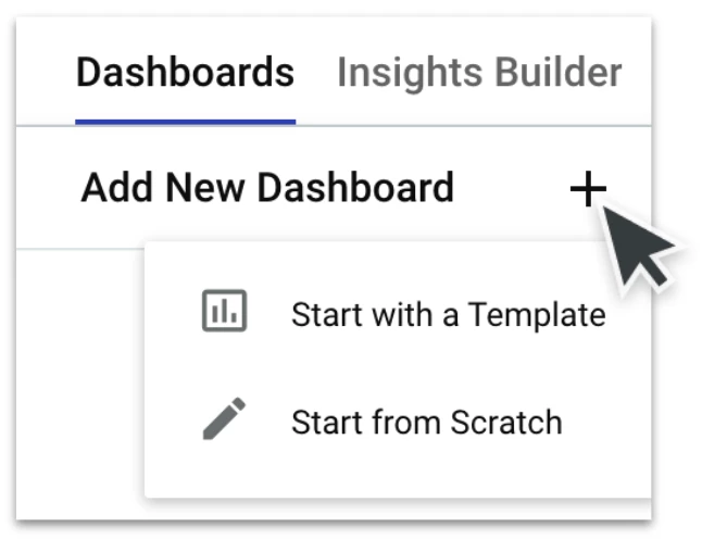
Note: It's a best practice to start with the template because it's a baseline of data that we've already defined as a good starting point. These templates give a wide overview of potential metrics you will need to hone in on.
Our reporting dashboard templates are:
-
Opportunity Pipeline
-
Understand the state of your deal pipeline with a view of your open Opportunities. Learn which team players can strive higher.
-
-
Sales Forecast
-
Visualize how close you are to meeting your goals with a look into won and open Opportunities. Identify where Opportunities need to close to reach your goals.
-
-
Sales Lost & Abandoned
-
Learn how to win more by visualizing where and why Opportunities are lost. Identify what growth Opportunities your team can lean into.
-
-
Sales Performance
-
Know what Opportunities win with a view of won Opportunities by Owner, Pipeline, and Source. Continue closing the Opportunities you win best.
-
-
Source Performance
-
Discover where your won Opportunities come from with a breakdown of deal sources and conversion rates. Consider investing in areas that lead to wins.
-
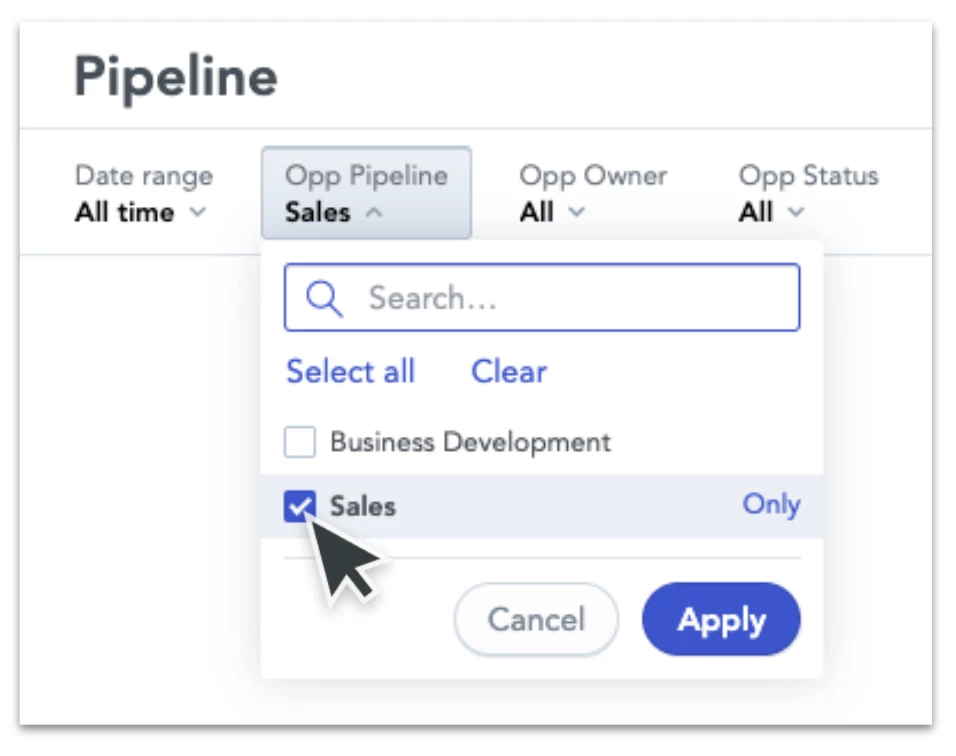
Select a template to create your first Report Dashboard! Once this report loads it will have already pulled in your data to complete the report. Make sure to use the filters at the top of the report to drill down and get more granular with your data.
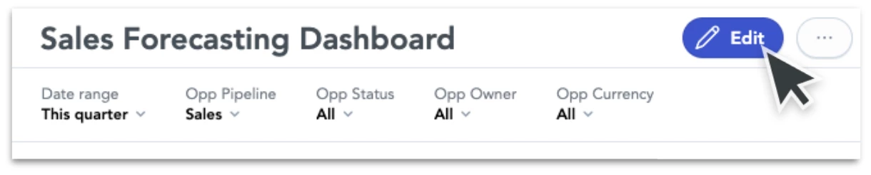
If you’d like to customize your report dashboard further you will want to edit it. Each report dashboard is made up of four sections: name, filters, KPIs, and Insights which you have the ability to customize each one of those sections. Simply close your left navigation to allow the page’s responsive design to load and show the “edit” button in the top right. Once you click on that button it will take you to the reporting dashboard editing tool.
This page contains drag-and-drop functionality giving an easy user interface to quickly customize the look and feel of your dashboard. You can add new filters and define the defaulted filters, move the organization of metrics, change the size and emphasis of each metric and rename the dashboard. Make sure to click the “Save and Publish” button at the top right to save your work.
Once your report dashboard is in a final stage you will then want to share this dashboard with pertinent stakeholders. At the top right of the dashboard, there is a light gray button with “...” that provides the two options to either export the dashboard as a PDF or to schedule emails.
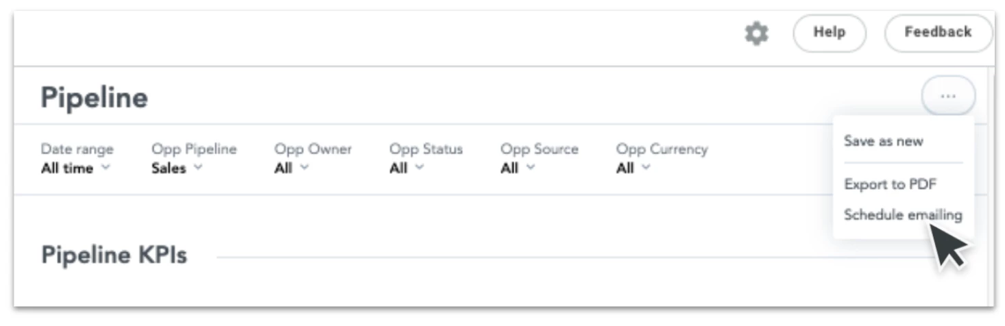
Our email functionality allows you to send the dashboard to emails in and outside of your company and at your desired cadence. Simply fill out your email list, the email subject, and message, and select the occurrence start date, time, and cadence. For example, you would be able to get a report every Monday morning for your desired data set. Note, keep in mind the 24-hour data refresh for the most up-to-date information.
Use the comment box below to let the Community know which reporting dashboard templates you’ve found the most beneficial and let me know any additional questions you may have.